Code for Care (Hackathon)
On Saturday, June 1st 2019, I attended the hackathon Code for Care organized by Humana Experience Center, at the District Hall (Boston, MA).
The goal of that hackathon was to build a digital software to help [not-necessary] elderly to manage their medications, taking special attention to those individuals with comorbidities (the simultaneous presence of two chronic diseases or conditions in the same individual).
There was no limitation in type of software nor in technology we could use for the development, although we were encouraged to use the FDA’s free drug data API, that provides access to data like adverse events, product labeling, and a full directory of all NDCs (National Drug Codes).
Idea
During the first hour of the event we formed teams of 3 and 4 people. In my team we were my work-makes In-hee and Francisco - from Boston Children’s Hospital -, and Benjamin, a very capable java engineer.
We started brainstorming and focused on developing a web portal aiming to become a meeting point between medical doctors and patients, off visits. This portal aimed to achieve 4 goals:
- For medical doctors. To provide the list of the current medications for a given patient in order to allow multiple doctors to be aware of all active and previous prescriptions.
- For medical doctors. To send a simple notification to a given patient when their medication is being updated.
- For patients. To have a really simple application with the medications that a given patient has to take in the present day - with all required details such as dose per pill, number of pills to take, and at each time of the day the patient has to take the pills.
- For patients. To provide a simple but efficient gamification of the medication intake by showing the proportion of accomplished days in a given medication treatment, as well as some “badges” when certain goals are achieved (e.g. all the pills for a week have been taken properly).
Implementation
We used the free account of heroku to create an app with python 3.7 as back-end language running gunicorn and flask, as well as a MySQL add-on.
Then, we split the tasks: Benjamin dealt with the android application, In-Hee designed and filled the data-base as well as the script to work with FDA’s API, Francisco was in charge of the design of the web application, and I worked on the server-side with python and flask.
Results
Main page

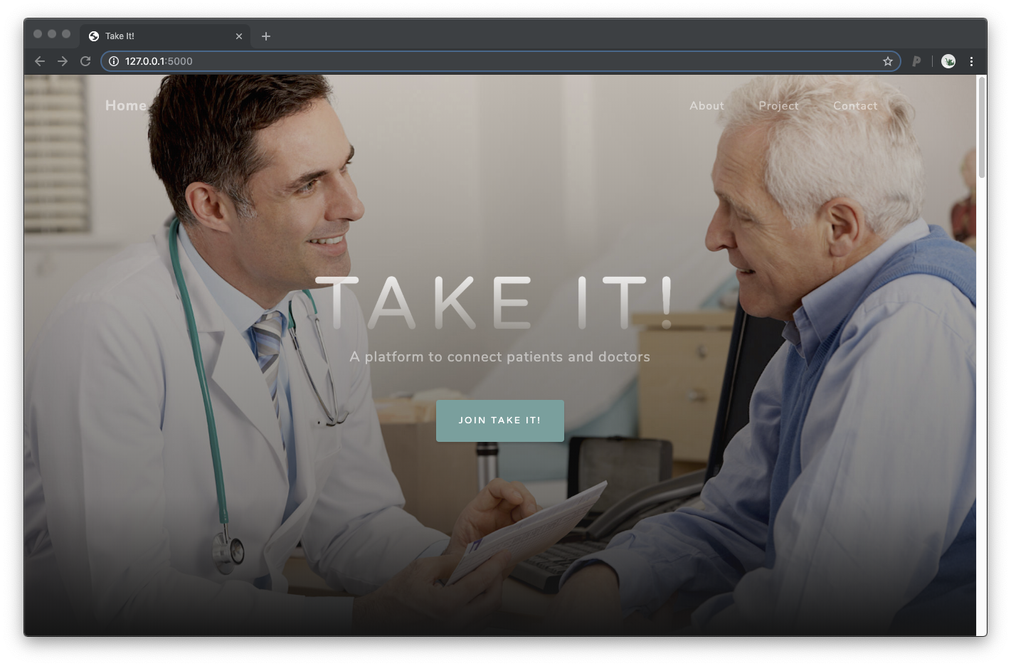
Take it! - Main page
The main page provides a short description of the web application and its goal, as well as the team who developed it.
Once we click on “JOIN TAKE IT!” we are moved to the login page. This one will flow to the medical doctor’s page or to the patient’s page.
Medical doctor

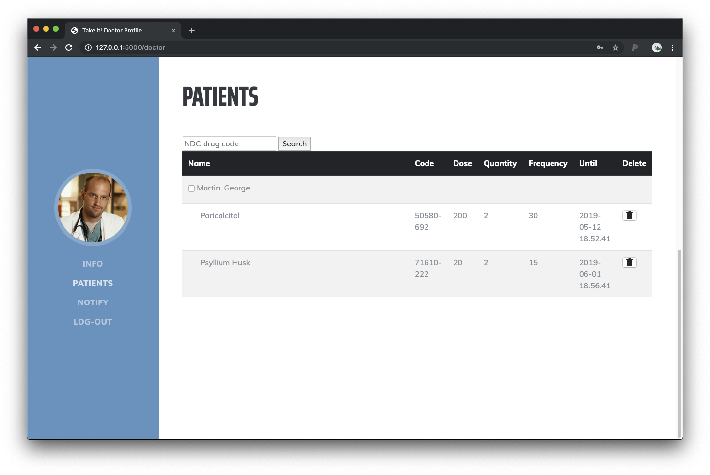
Take it! - Medical doctor page
The page for medical doctors lists all the patients a doctor is attending. For each patient all its active medications are listed. New medications can be added using the text box at the header of the table by providing the NDCs (National Drug Codes) from FDA’s. We used the FDA’s API to grab the information of the drug and create a new prescription. The medications, obviously, can also be removed.
The menu on the left of the page allows the doctor to move to the notification area. We had not enough time to implement the notification area within the same web application, so the current link moves to Google Firebase, which allows the doctor to send notifications to a given patient.
Patient
The patient’s page is divided in two sections: 1) the medication section, and 2) the badge section.

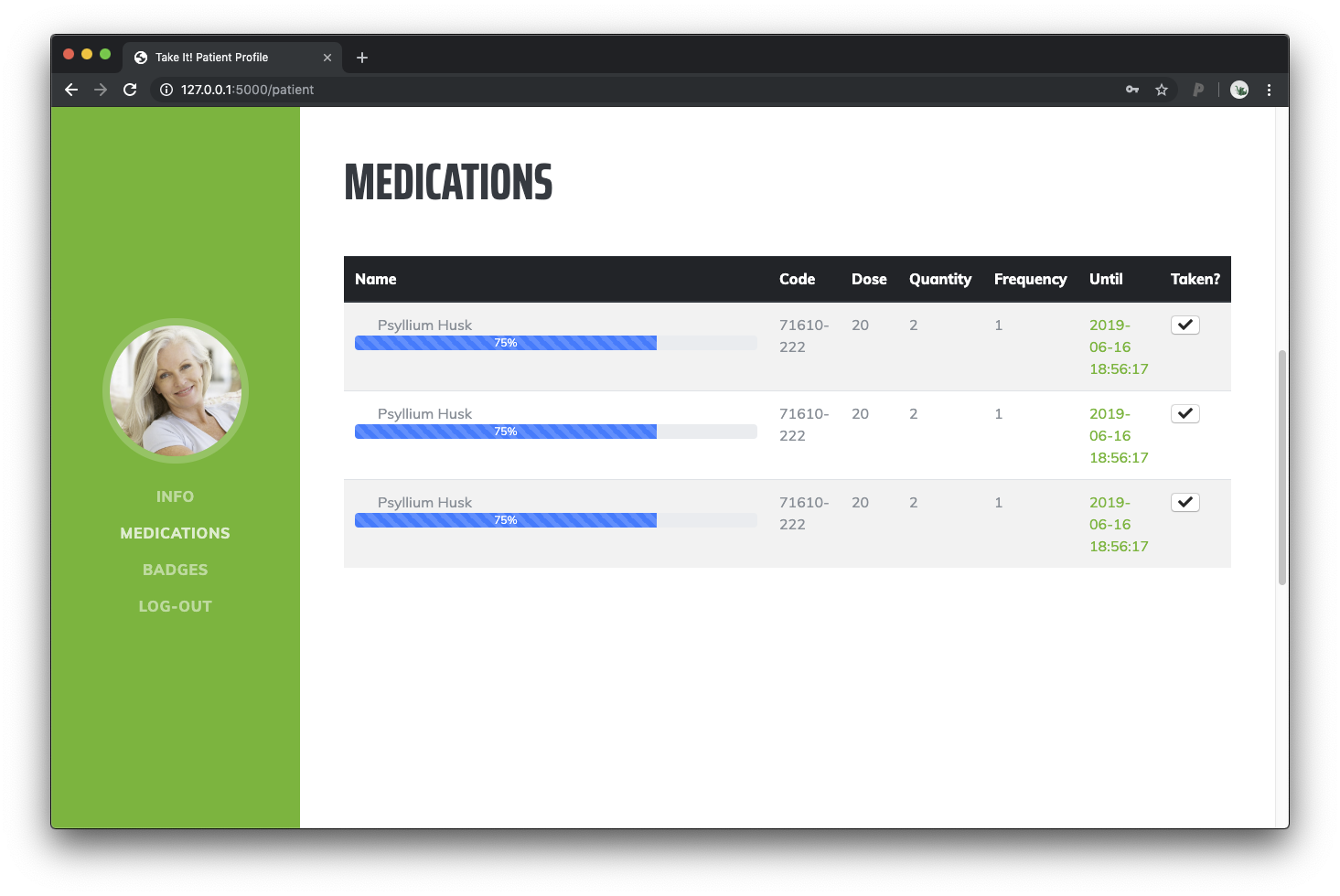
Take it! - Patient page for medication
The medication sections shows the current active medications to the patient, indicating the name of the drug and the amount of it to take. One of our main goals was to engage the patient. To do so we placed progress bars thatindicates how far the patient is going with the “challenge” or “mission” (i.e. how many days of prescription the patient went through).
Each time the patients take the medication also click the button on the right side of the table. This is used to follow up the patients and to give them the appropriate badges.

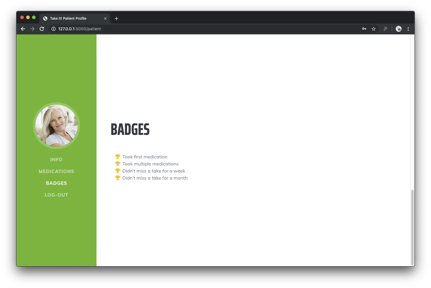
Take it! - Patient page for badges
The badge sections follows with our idea of engaging the patients and shows the multiple badges they earned until the date.
Classification
After a brief presentation of our idea and our web application, joint to a short demo of firebase notifying our mobile phone, the jury started to evaluate the multiple projects.
From a total of 6 projects, “TAKE IT!” won the 1st position of the contest! Here a prof of it:
Conclusion
After many years outside of the (pure) software development and hackathon world I really enjoyed participating in the event.
The organization was amazing, and the Humana’s team provided feedback on our idea as well as mentored us to make it happen.
This event was a success! Thanks so much to all the participants who came out. Thanks sooo much @jcramos426 for all your hard work and organization. https://t.co/3W8K4YJHgX
— Jason McKee (@mckeejm) June 2, 2019
The team was amazing. All of us were able to contribute to the idea, as well as to its implementation. We moved from step to step smoothly, no frictions nor discussion. T-E-R-R-I-F-I-C!
Yeah… let’s repeat?